Picture how most people in India first find a business today. They are standing in a queue, riding a bus through Coimbatore traffic, or sitting at a tea stall, and they pull out a phone to search. They are not at a desk. For a very large share of the country, a smartphone is not the second screen after a laptop — it is the only screen they have ever used to go online. For the businesses those people are searching for, this changes everything. The mobile version of your site is not a shrunken copy of the "real" website. On mobile, it is the website.
India came online during the smartphone era, not the desktop era. Affordable Android handsets and some of the cheapest mobile data in the world meant that millions of first-time internet users skipped the PC entirely. That history is why designing for the phone first is not a nice-to-have here. It is the baseline expectation, and getting it wrong quietly costs you customers you never even see.
The Indian internet lives on a mid-range Android phone
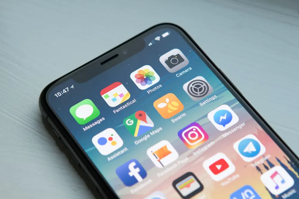
When we talk about "mobile" in India, it helps to be specific about what that actually means. It usually means a mid-range Android device, not the newest flagship. It means a screen a person is holding with one hand, often outdoors in bright sunlight. And it very often means a connection that swings between a strong signal and almost nothing as the person moves, on a data pack the user is quietly conscious of spending.
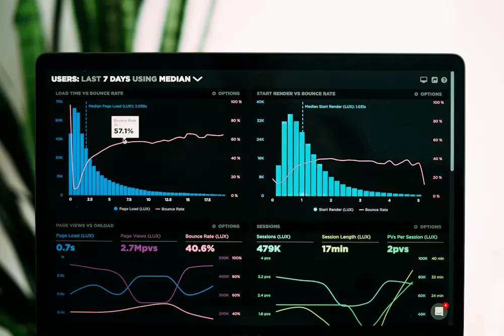
Design decisions that feel harmless on a fast office broadband connection behave very differently on that phone. A heavy homepage that loads instantly on your designer's laptop can take many long seconds on a real handset on mobile data. A person waiting that long usually does not wait. They tap back and open the next result — often a competitor.
"Mobile-first" is a mindset, not a media query
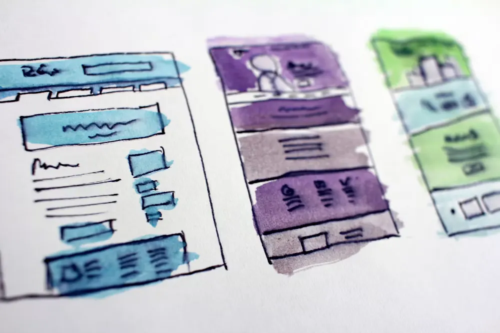
Many websites are technically responsive but were never truly built for mobile. They were designed on a wide screen with lots of room, packed with columns and menus, and then squeezed down for phones as an afterthought. The result works, in the sense that nothing overlaps, but it feels cramped and awkward. Buttons sit too close together. Text is tiny. Important actions hide below a wall of content.
Mobile-first flips the order of the work. You start with the smallest screen and the tightest constraints, decide what genuinely matters, and design that experience to feel effortless. Only then do you add space, columns and richer layouts for people on tablets and desktops. Because you began with limits, you were forced to make choices about priority early — and those choices produce a clearer, calmer site on every device, not just the phone.
Google reads your phone site, not your desktop site
There is a hard commercial reason to take this seriously beyond user comfort. Google now uses mobile-first indexing, which means it primarily looks at the mobile version of your pages to decide how to rank you in search. If your desktop site is rich but your mobile experience is thin, slow or broken, that weaker mobile version is effectively the one competing for rankings. A strong phone experience is no longer just good manners; it is part of being found at all.
What good mobile-first design actually looks like
Once you accept the phone as the starting point, a set of practical habits follows naturally. None of them are exotic — they are simply what respect for a one-handed, on-the-go user looks like in practice.
- Lead with one clear action. On a small screen there is no room to hedge. Decide the single most important thing a visitor should do — call, enquire, book, buy — and make that action obvious and easy to reach without scrolling forever.
- Make tap targets big and thumb-friendly. Fingers are not mouse pointers. Buttons and links need generous size and spacing, placed within comfortable reach of a thumb rather than crammed into corners.
- Keep text readable. Body text should be at least 16px so nobody has to pinch and zoom. Comfortable line lengths and good contrast matter even more in bright outdoor light.
- Stay light and fast. Compress images, use modern formats like WebP, and lazy-load anything below the first screen so the page is usable quickly. This is closely tied to overall page load speed, which shapes both patience and rankings.
- Never rely on hover. There is no hover on a touchscreen. Menus and information that only appear when a mouse hovers simply vanish for mobile users, so every interaction must work with a plain tap.
- Shorten and simplify forms. Ask for the least you truly need, and trigger the correct on-screen keyboard — a number pad for phone numbers, an email keyboard for email — so filling a form on a phone stops feeling like a chore.
Test on a real phone, not a resized browser
One of the most common mistakes we see is teams checking their site only by dragging a desktop browser narrow. That tells you almost nothing about how a real mid-range handset behaves — its actual touch accuracy, its slower processor, its real network. Before launch, open the site on the kind of phone your customers genuinely carry, on mobile data rather than office Wi-Fi, and use it the way they would. Problems that were invisible on the desktop become obvious in seconds.
India is many languages and many readers
Tamil Nadu, and India more broadly, is not one audience. Visitors arrive with different first languages and very different comfort with reading dense English. That is one more argument for clarity: short sentences, clear labels, and visuals that carry meaning on their own help far more people succeed on your site. A well-chosen icon or photograph can communicate across a language gap that a paragraph cannot. Designing simply is not dumbing down — it widens the door.
For a business in Coimbatore or anywhere in India, the takeaway is direct. Your customers are meeting you on a phone, often on a modest device and a watchful data plan, frequently as their only way online. Build for that person first and everyone else is served well too. That is exactly how we approach website design at Pavazhi — the phone is where we start, not where we compromise.