Nautilus Outfitters: a dive-gear store built to convert
This is a self-initiated concept project — not a real client engagement — created to show how we approach this kind of work. It replatforms a beloved but creaking outdoor retailer into a fast, trustworthy storefront designed to grow revenue without spending a dollar more on ads.
Project type
Self-initiated concept
Industry
Outdoor & watersports retail e-commerce.
Services
Platform migration, storefront design, checkout UX, performance engineering.
Timeline
14 weeks, including catalogue migration and a phased cutover.
The challenge
Nautilus had built a loyal following on expertise — the kind of shop where staff know which regulator suits a cold-water diver. But their online store told none of that story. It ran on an aging platform that buckled during sales, hid shipping costs until the final step, and rendered product pages that took five seconds to load on the phones most customers were actually using.
The symptoms were textbook: a checkout abandonment rate north of 78%, mobile conversions less than a third of desktop, and a catalogue so hard to navigate that best-selling gear was effectively invisible. Every marketing dollar was pouring visitors into a leaking hull.
The approach
We'd treat a build like this as a revenue problem first and a design problem second. Before touching a pixel, we'd map the entire funnel, watch session recordings, and find the moments where buyers bail — then rebuild around them.
- ◆Migration to a modern headless stack. Faster pages, reliable inventory sync and no more crashes during peak-season sales.
- ◆Honest pricing from the first screen. Shipping estimates and stock appear on the product page, not as a nasty surprise at checkout.
- ◆Guided merchandising. Fit finders and bundle suggestions surface the expert advice Nautilus is known for, right where decisions happen.
- ◆A one-page, wallet-ready checkout. Express payments, saved carts and a recovery flow that brings abandoners back.
A store that sells like their best clerk
The new Nautilus storefront loads in under two seconds on mobile and greets shoppers with a merchandised homepage that changes with the season. Product pages carry real photography, clear specs, honest stock and a "which one is right for me?" guide that quietly upsells complementary gear.
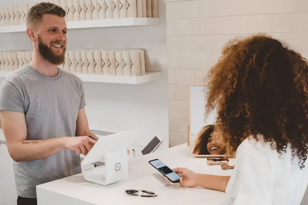
The checkout collapses from four steps to one, with Apple Pay and Shop Pay front and centre. An automated recovery sequence emails shoppers who leave gear behind — the kind of flow designed to win back a meaningful share of otherwise-lost orders.

The outcomes a build like this aims for
"Don't just deliver a nicer website — turn the store into Nautilus's best salesperson: one that sounds like them and makes checkout the easiest a diver has ever used."
— The brief this concept set out to answer
Tidewell Health
A concept healthcare rebrand and accessible website designed to grow bookings.
Read case study →
Let's stop the leaks
If your store gets traffic but not enough orders, the money is usually in the funnel. We'll help you find it.