
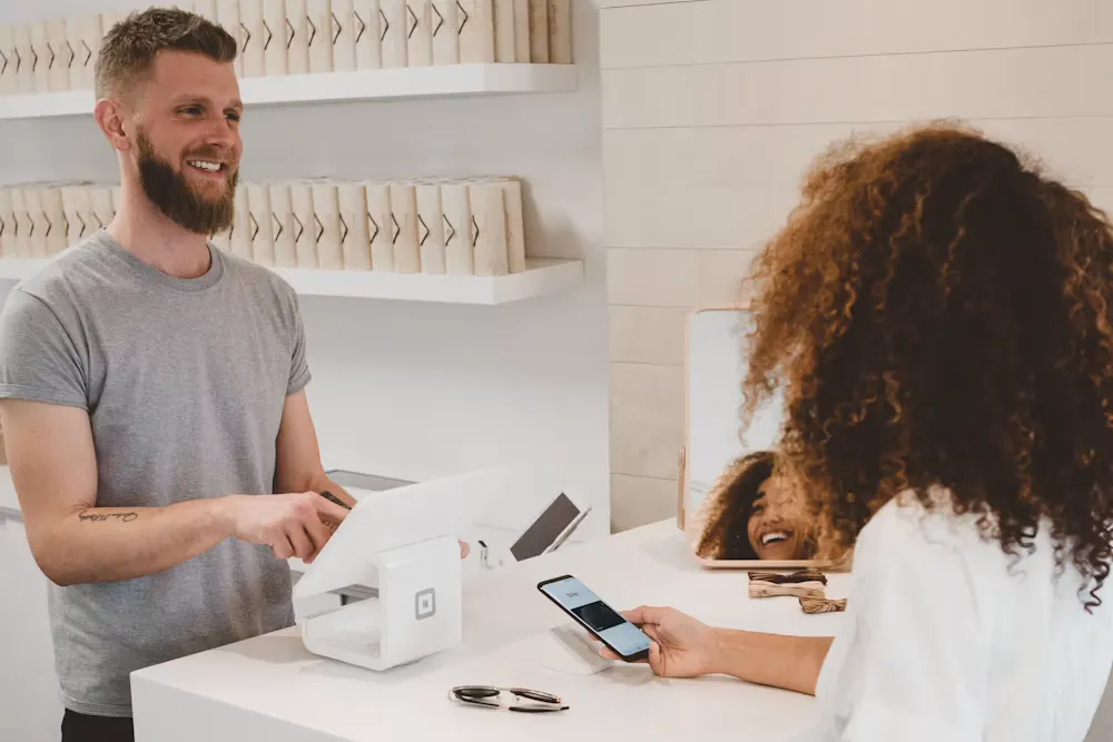
Of all the friction on an online store, the friction at checkout is the most expensive. Think about who is standing there. Someone browsed your catalogue, weighed the options, picked a product, added it to the cart, and clicked through to pay. That person is not a curious visitor. That person has already decided they want to buy. When they leave at this stage, you have not lost a maybe — you have lost a customer who was ready to hand you money and could not.
This is why checkout deserves more attention than almost any other page. A confusing product listing loses browsers; a broken checkout loses buyers. The good news is that most of the reasons carts get abandoned are not mysteries of consumer psychology. They are ordinary, fixable design mistakes. Here are the ones that quietly drain revenue from stores every day, and what to do about each.
Forcing account creation before payment
The single most common mistake is putting a wall between the shopper and the pay button: "Create an account to continue." To the store owner it feels harmless — even helpful, because accounts mean repeat data. To the shopper it feels like being asked to sign a contract before buying a bar of soap. Many will simply leave.
The fix is to offer guest checkout as the default, front and centre. Let people buy with just an email and a delivery address. You can still invite them to create an account after the order is placed, when the friction is gone and the value is obvious ("Save these details for next time?"). You will find most people happily opt in once they are no longer being blocked.
Hiding shipping costs and taxes until the last step
Nothing kills a sale faster than a surprise. A shopper builds a mental price as they go, and when a shipping charge or tax appears only on the final screen, the total suddenly feels dishonest — even when it is perfectly fair. That jolt of "wait, why is it more?" is one of the biggest single causes of abandonment.
Show the full cost as early as you reasonably can. Put a shipping estimator on the cart page, display taxes as line items rather than folding them into a vague total, and if you offer free delivery over a threshold, say so loudly ("Add ₹300 more for free shipping"). Transparency early builds the trust that carries someone all the way to payment.
Too many steps and too many form fields
Every field is a small tax on the shopper's patience, and every extra page is a fresh chance to reconsider. Asking for a company name, a landline, a second address line nobody uses, or the same information twice adds effort without adding value.
Ask only for what you genuinely need to fulfil and deliver the order. Use address autofill and PIN-code lookups so a city and state populate themselves. Combine steps where you can — a well-built single-page checkout, or a tight two- or three-step flow, almost always outperforms a long wizard. The goal is simple: the shopper should feel they are moving toward "done," not filling out a form at a government office.

No sense of progress
When a checkout has multiple steps but no map, people feel lost. "How much more of this is there?" is an anxious question, and anxious shoppers abandon. A clear progress indicator — Cart, Address, Payment, Confirm — turns an open-ended task into a short, visible journey. It costs almost nothing to add and reassures the shopper at every click that the end is near.
Too few payment options — especially for India
A shopper who cannot pay the way they prefer will not switch to your way. They will switch stores. In India this matters more than almost anywhere, because payment habits are diverse and strongly held.
A checkout built for Indian shoppers should comfortably support:
- UPI — for many buyers this is now the default; a one-tap UPI flow removes enormous friction.
- Debit and credit cards, with saved-card convenience where allowed.
- Net banking for those who still prefer their bank's flow.
- Wallets that a portion of your audience already keeps topped up.
- Cash on Delivery, which remains a genuine trust bridge for first-time buyers who are not yet ready to pay upfront.
You do not need every option under the sun, but you do need the ones your customers actually use. Offering COD alongside UPI, in particular, can be the difference between a hesitant first-timer and a completed order.
A checkout that fights the phone
Most Indian shoppers are on a phone, often on a mobile connection, frequently one-handed on the move. A checkout designed on a desktop and never truly tested on a small screen will quietly lose the majority of your traffic.
Make tap targets big and well spaced so nobody mis-taps the wrong button. Trigger the correct keyboard for each field — a numeric keypad for phone numbers, PIN codes, and card numbers. Minimise typing wherever possible with autofill, saved details, and sensible defaults. Every awkward pinch-zoom or tiny link is a reason to give up, and on mobile people give up fast.
Missing trust signals
Handing over money and an address requires trust, and small stores have to earn it visibly. A checkout that looks even slightly unsafe will lose careful buyers. Serve the entire flow over HTTPS, show a recognisable security or payment-gateway badge near the pay button, and keep your return and refund policy one clear click away. Displaying a real support number or email reassures people that a human exists behind the store if something goes wrong.
Slow, error-prone forms with unhelpful messages
A checkout that lags, or that rejects an entry with a blunt "Invalid input," makes the shopper feel the fault is theirs — and that feeling ends sessions. Good microcopy does a lot of quiet work here. Tell people exactly what went wrong and how to fix it ("Please enter a 10-digit mobile number"), validate fields as they type rather than only on submit, and never make someone re-enter everything because one field failed. Speed matters too: a payment step that spins for several seconds without feedback feels broken even when it is working.
No saved cart and no way to recover it
People get interrupted — a phone call, a knock at the door, a low battery. If your store forgets their cart the moment they leave, you have thrown away a warm lead. Persist the cart across sessions so it is waiting when they return, and if you have their email, a gentle, well-timed reminder ("You left something behind") recovers a meaningful share of otherwise-lost orders.
Surprise delivery times and unclear stock
Finally, vagueness at the end erodes the confidence you built. "Ships soon" is not an answer. Show a realistic delivery window based on the PIN code, and make stock status honest and visible — "In stock, dispatched in 2 days" converts far better than silence. If an item is low or backordered, say so before payment, not after. Nobody minds waiting when they chose to wait; they mind being surprised.
The pattern behind all of them
Read these mistakes together and one theme emerges: every one of them replaces certainty with doubt at the exact moment the shopper is ready to commit. Fixing checkout is really about removing doubt — being clear about cost, quick about forms, generous with payment choices, honest about delivery, and respectful of the phone in the customer's hand. None of it is exotic. It is disciplined attention to the last, most valuable stretch of the journey. If you are building or rebuilding a store, treat the checkout as the centrepiece it is — that is exactly where thoughtful e-commerce development pays for itself.